
Morning coffee. Go to the lab. Open the computer. Click into LIMS... and boom - a dashboard full of things you never use.
If that sounds familiar, you’re not alone. In fact, it’s the most common feedback we hear about LIMS dashboards:
they exist, but they don’t really work for the people using them.
This article is about the first screen you see in LIMS: the dashboard.
And why customisation is the difference between a page you want to open and one you immediately click past.
The usual dashboard story
Dashboards love pretending they’re useful. In reality:
- Study Managers drowning in over-detailed scientific data
- Scientists staring at management charts that add no value
- Quality teams scrolling endlessly for relevant answers
We ran into exactly this in a custom LIMS project.
The fix? Smart customisation - trimming the noise, surfacing the essentials, and tailoring the view for each role.
Why one-size-fits-all doesn’t work
The “one dashboard for everyone” approach sounds simple but backfires quickly. Every role in the lab needs different information to start the day productively.
Luckily, most LIMS already have Roles/Permissions.
The trick is using them for dashboards:
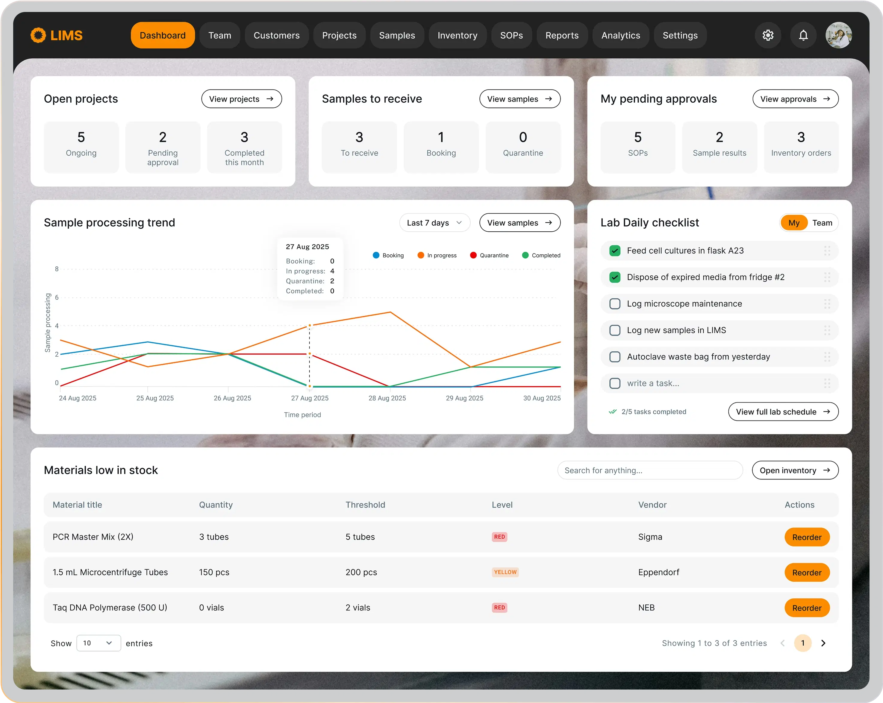
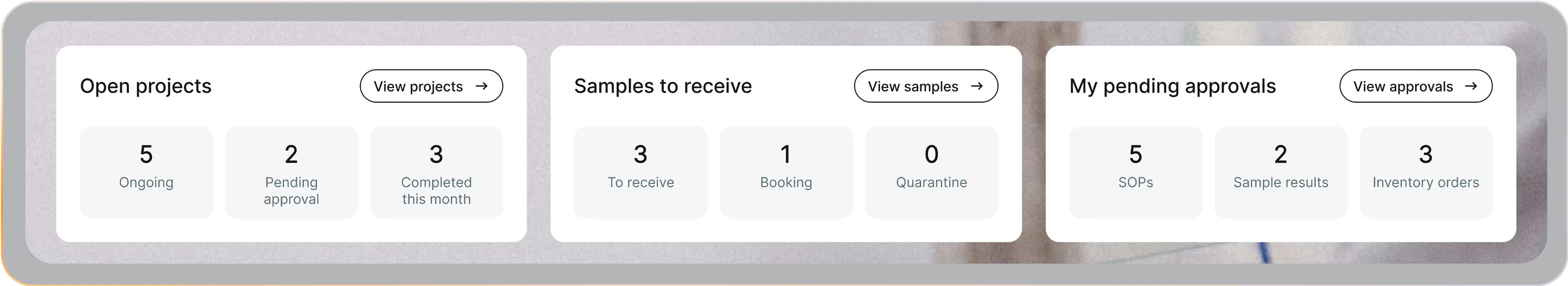
Lab Manager view:
Scientist view:
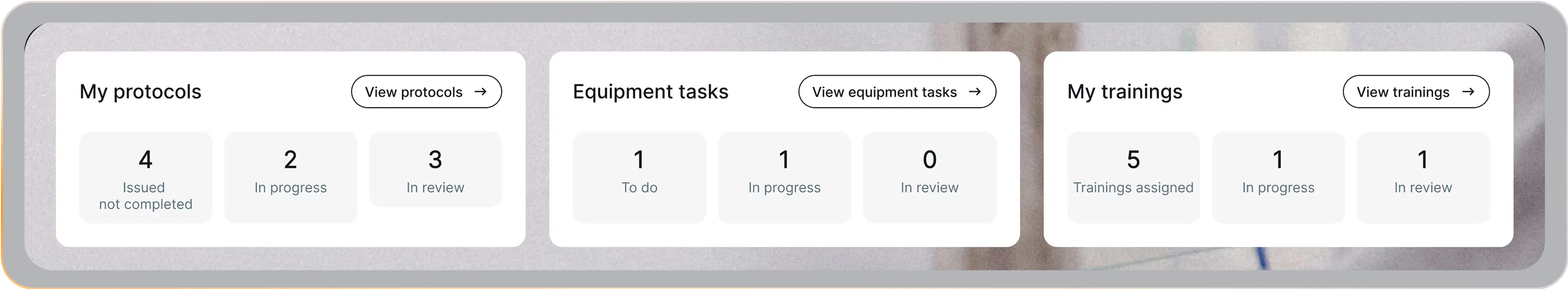
Same system. Same data. Just role-specific lenses that actually make sense.
Here are three examples from that customisation project:
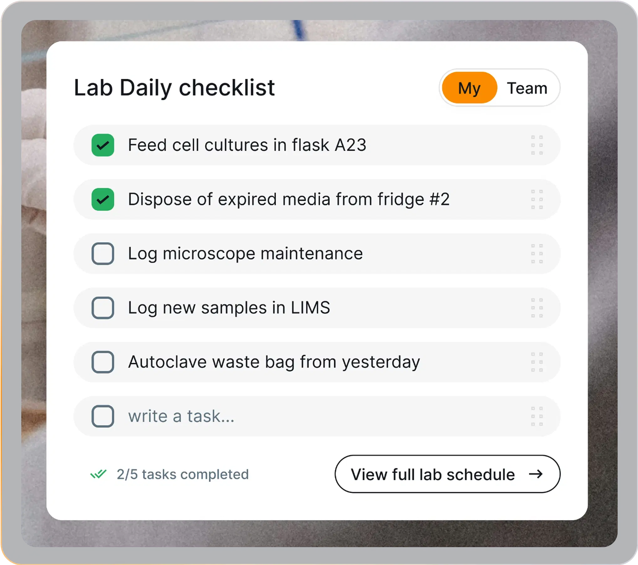
1. Personal tasks widget
Before: tasks lived everywhere - Trello, sticky notes, Teams, even memory.
Translation: things slipped through the cracks.
Now: a daily checklist widget inside LIMS. Tasks are tracked in one place, easy to add, easy to complete.
No more "oops, forgot that sample".
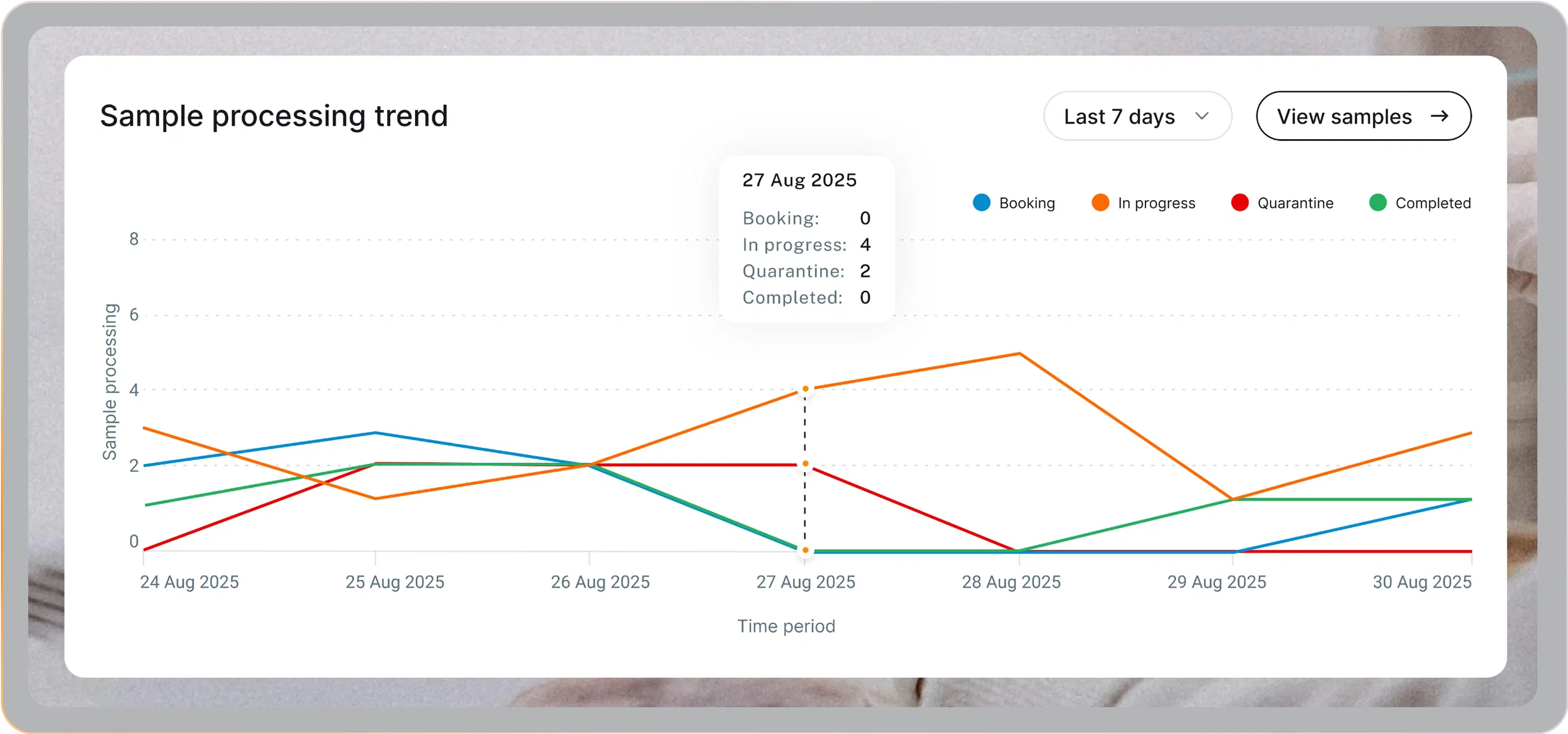
2. Sample trends at a glance
Lab managers don’t need a data swamp; they need a quick pulse check. Custom sample trends show what’s happening in real time: pending samples, what’s in progress, and where bottlenecks form.
One glance is enough to know if the lab is on track.
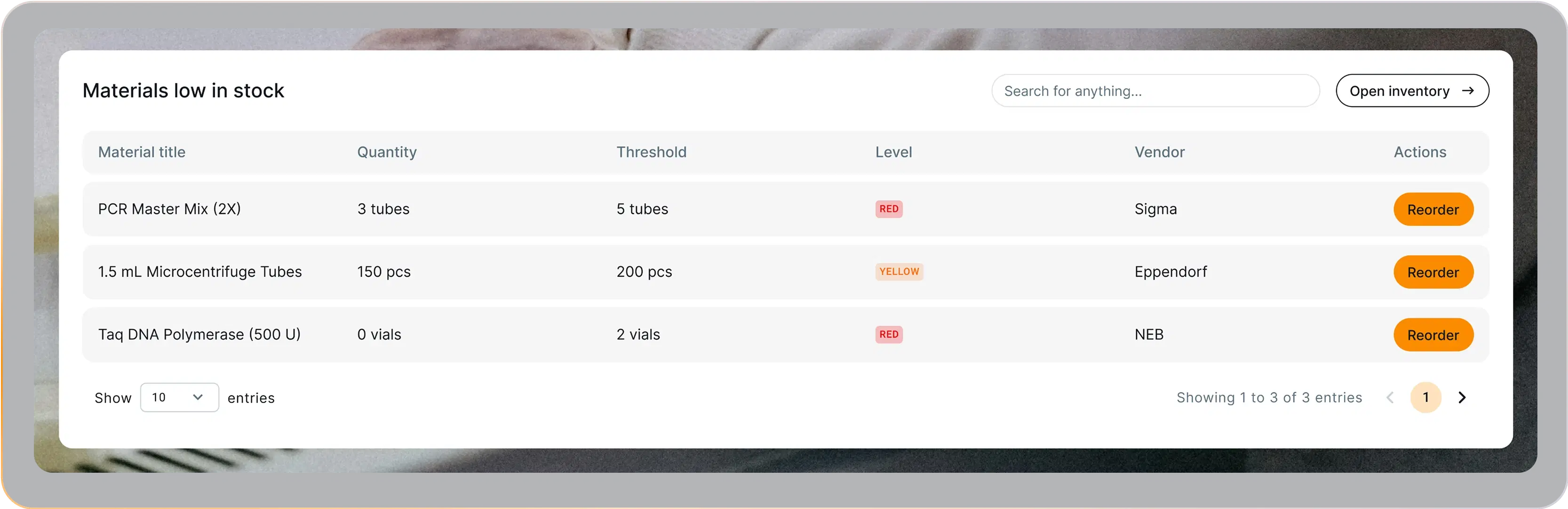
3. Low-stock widget
Nothing kills momentum like discovering a reagent is gone after you need it.
A low-stock widget flips that:
- Custom thresholds for key materials
- Alerts before shortages hit
- Instant reorder buttons
Result: smoother operations, fewer nasty surprises.
The results
This isn’t theory - these were fixes we actually implemented in a custom LIMS project.
The outcome?
- No wasted minutes hunting for the right data
- No critical updates buried in noise
- Teams start the day focused, not frustrated
The dashboard became something rare: a page people actually want to open.
The best part is that dashboard customisation isn’t a massive project. The data is already in your LIMS - the real question is what should surface, and for whom.
These fixes worked in our project, and they can work in yours too. So if your dashboard still feels useless, ask your devs to redesign it.
And if you don’t have the right devs… well, we can help 😉